Emote Accessibility Guide: Designing Inclusive Emotes for All Viewers (2025)
Make your Twitch emotes accessible to everyone. Learn about color blindness considerations, contrast requirements, and design practices for inclusive emotes.
Great emotes work for everyone—not just viewers with perfect vision. Approximately 8% of men and 0.5% of women have some form of color blindness, and many more viewers deal with visual impairments or simply watch on small, dim screens. Designing with accessibility in mind makes your emotes better for everyone.
Accessible design isn't about limiting creativity—it's about making smart choices that ensure your emotes communicate clearly to the widest possible audience.
Understanding Color Blindness
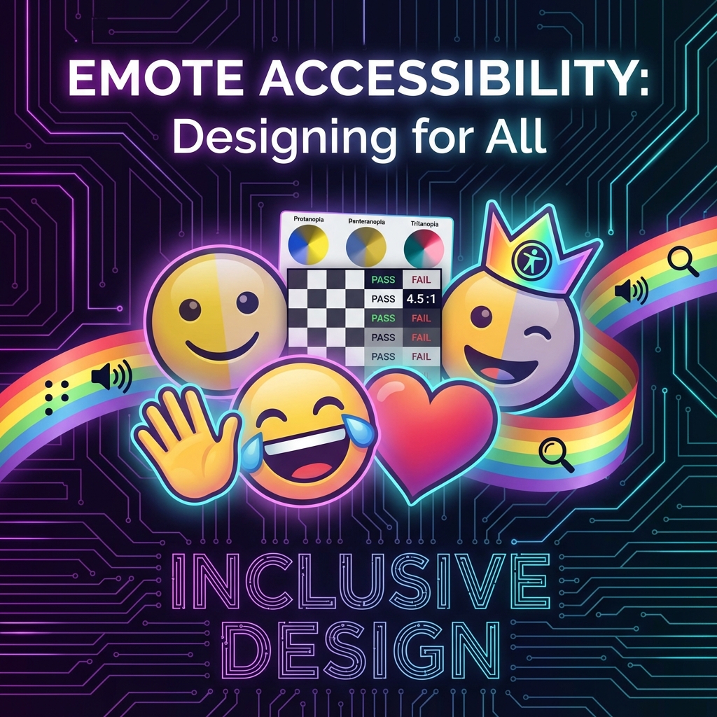
Types of Color Blindness
- Deuteranopia (green-blind): Most common. Reds and greens look similar
- Protanopia (red-blind): Reds appear dark or black, green/yellow can look similar
- Tritanopia (blue-blind): Rare. Blues and greens look similar, yellows can appear pink
- Monochromacy: Very rare. Complete color blindness
The Red-Green Problem
Since red-green confusion is most common, avoid designs that rely on distinguishing between red and green:
- A "yes" (green) vs "no" (red) emote pair may look identical to some viewers
- Character emotions shown only through color (green=happy, red=angry) need additional visual cues
- Subtle green-on-red or red-on-green color combinations can disappear entirely
Contrast and Readability
The 28×28 Challenge
At Twitch's smallest display size, contrast becomes critical. What reads clearly at 112×112 can become muddy at 28×28.
Contrast Best Practices
- High contrast between elements: Dark outlines on light fills, or vice versa
- Avoid similar value colors adjacent: Two colors can be different hues but similar brightness, making them hard to distinguish
- Test in grayscale: If your emote reads well in black and white, it has good value contrast
- Consider dark/light mode: Twitch chat can be dark or light theme
Testing Your Contrast
- Convert your emote to grayscale (desaturate)
- Shrink to actual display size (28×28)
- Can you still understand what the emote represents?
- If not, increase contrast between key elements
Shape and Silhouette
Why Shape Matters
An emote with a strong, recognizable silhouette works for:
- Color blind viewers
- Viewers watching on low-quality streams
- Small or dim phone screens
- Anyone quickly scanning a busy chat
The Silhouette Test
Fill your emote with solid black. Is it still recognizable? If the emotion or action reads from shape alone, you've created an accessible design.
Adding Visual Cues Beyond Color
Don't communicate meaning through color alone:
- Expressions: Show emotion through eyes, mouth, body language—not just color
- Symbols: Add hearts, stars, tears, sweat drops to reinforce meaning
- Posture: Slumped = sad, bouncing = excited, regardless of color
Light and Dark Theme Compatibility
The Problem
Twitch viewers can use dark mode (dark background) or light mode (light background). An emote optimized for one may fail on the other.
Solutions
- Always include outlines: A dark outline helps on light backgrounds, a light glow/edge helps on dark
- Avoid pure white or pure black fills: These can disappear against matching backgrounds
- Test on both backgrounds: Before uploading, preview your emote on dark and light
The Safe Middle Ground
Using a visible outline (usually dark) around your main elements ensures the emote remains visible regardless of background. Most well-designed emotes have this automatically.
Animation Accessibility
Motion Sensitivity
Some viewers are sensitive to motion and flashing. For animated emotes:
- Avoid rapid flashing: More than 3 flashes per second can be problematic
- Keep motion smooth: Jerky animations are harder on the eyes
- Limit extreme motion: Subtle animations are often more effective anyway
Ensuring Animation Reads
At small sizes with potential color blindness, animated emotes need clear motion:
- Make the motion obvious, not subtle
- Ensure each frame is readable on its own
- Use shape/position changes, not just color changes
Practical Accessibility Checklist
Before finalizing any emote:
- Grayscale test: Does it read in black and white?
- Size test: Is it clear at 28×28 pixels?
- Silhouette test: Is the shape recognizable when filled solid?
- Background test: Does it work on both dark and light backgrounds?
- Color blindness simulation: Use tools to preview how it looks to color blind viewers
- Expression test: Is the emotion clear without relying on color?
Tools for Testing Accessibility
- Color Oracle (Desktop): Free color blindness simulator
- Coblis: Online color blindness simulator
- Photoshop/GIMP: Built-in color blindness proof views
- Contrast checkers: WebAIM Contrast Checker for verifying contrast ratios
Better Design for Everyone
Accessible emotes aren't a separate category—they're just well-designed emotes. The constraints of accessibility (high contrast, clear shapes, multiple visual cues) are exactly what makes emotes work at tiny sizes.
When you design for the viewer with the most limitations, you create something that works perfectly for everyone else too. That's the power of inclusive design.
Final Thoughts
Accessibility considerations should be part of your design process from the start, not an afterthought. Train yourself to instinctively check contrast, test at small sizes, and include shape-based communication.
Your emotes will reach more people, communicate more clearly, and simply work better. That's not a limitation—that's good design.
When your accessible emotes are ready, StreamEmote generates properly sized versions for every platform—ensuring your inclusive designs reach everyone, everywhere.
About the Author
StreamEmote Team
Written by the StreamEmote Team — developers and content creators dedicated to helping streamers succeed. We've processed hundreds of thousands of emotes and share our expertise to help you create the best content for your channel.
Learn more about us →Ready to Resize Your Emotes?
Use our free tool to create perfectly sized emotes for Twitch, Kick, and Discord. No watermarks, no uploads—your images never leave your device.
Try the Emote Resizer →Related Articles
Complete Twitch Emote Size Guide for 2026: Everything Streamers Need to Know
Master Twitch emote requirements with our comprehensive 2026 guide. Learn exact pixel dimensions (28x28, 56x56, 112x112), file formats, optimization tips, and common mistakes to avoid.
How to Create Animated Twitch Emotes: The Complete 2026 Guide
Learn to create smooth, engaging animated Twitch emotes that meet all requirements. Covers GIF optimization, frame rates, file size tricks, and recommended software.